
Views: 0 Author: Site Editor Publish Time: 2026-10-15 Origin: Site


A memorable table does not require every plate to have an unusual shape. A restaurant can create a recognizable presentation through a repeated curve, a restrained texture, or one accent piece reserved for a signature dish. The challenge is preserving that identity when the kitchen is busy and replacements are needed. Commercial dinnerware must work as both a design choice and an operating system. Start by deciding what guests should notice, then establish how each piece supports the menu and moves through service. Distinctiveness becomes more convincing when it is consistent, practical, and connected to the food rather than added as decoration alone.
Key Takeaways: Build a versatile base, assign a clear job to each accent piece, and define the visual rules that connect them. Trial commercial dinnerware with real dishes and normal handling. Keep variation intentional, and agree how repeat orders or substitutes will preserve the restaurant's presentation.
Translate the restaurant's identity into observable tabletop choices. Instead of asking for something unique, describe a desired relationship between food, room, and dinnerware. A restrained dining room might need a subtle edge detail. A lively sharing concept might benefit from repeated shallow shapes that arrange neatly across the table.
Choose a small number of design cues that can repeat across courses. These might be a softly rounded silhouette, a particular white tone, a narrow colored band, or texture around a clear central well. The cues should remain visible with food present; a striking empty plate is not necessarily a distinctive serving plate.
A base collection carries the everyday menu and the largest stock volumes. Accent pieces create specific moments: a starter, a shared dish, or the dessert associated with the restaurant. This division allows commercial dinnerware to feel distinctive without making every service dependent on many narrowly specialized items.
Set the number of accent items according to menu need and operating capacity. There is no universal ideal percentage. A tasting-menu restaurant can manage more course-specific pieces than a compact venue where a small team washes and resets tables rapidly. The important limit is the number of items staff can identify, store, and replenish reliably.
A plate assigned only to one short-lived seasonal dish can become stranded stock. Before purchasing, identify another suitable use for it. That fallback should be tested with actual food, not assumed from outside dimensions. A shallow starter plate might also serve dessert; it may be inappropriate for a sauced main.
A practical example is a signature dessert presented on a textured white plate while mains remain on a simpler shape. The recurring texture can establish continuity through selected courses. When the dessert changes, the plate may remain useful if its working area and proportions suit the next presentation.
Color, silhouette, texture, and decoration have different consequences. Pick the feature that communicates your concept while creating the least unnecessary complexity. Combining every feature at once makes it harder to identify why the presentation works and which compromises the operation must manage.
Design choice | Possible contribution | Operational check | Common misstep |
|---|---|---|---|
Distinctive silhouette | Creates a recognizable outline | Table footprint, rack clearance, and grip | Assuming unusual shapes fit existing equipment |
Textured rim | Adds detail around a quieter food area | Cleaning access and stack contact | Extending difficult texture across the eating surface |
Colored accent | Connects selected dishes with the room | Contrast under actual lighting | Approving color with an empty plate only |
Printed pattern | Establishes a repeatable visual motif | Decoration wear and food visibility | Letting the pattern compete with sauces or garnish |
Custom shape or artwork | Creates a more specific visual identity | Approval stages and repeat-order terms | Commissioning before menu functions are defined |
White commercial dinnerware does not have to look anonymous. Profile, texture, and the transition from rim to center can create a recognizable character while retaining a broad range of food pairings. This can be useful for menus that change frequently or contain many different ingredient colors.
Rollin Porcelain's White Coupe Dinner Plates provide a white design with sunflower-petal-inspired detailing. That offers a visual starting point for a distinctive table without requiring a strong colored background. Confirm the exact ceramic body in the purchasing specification before comparing it with other commercial dinnerware collections.
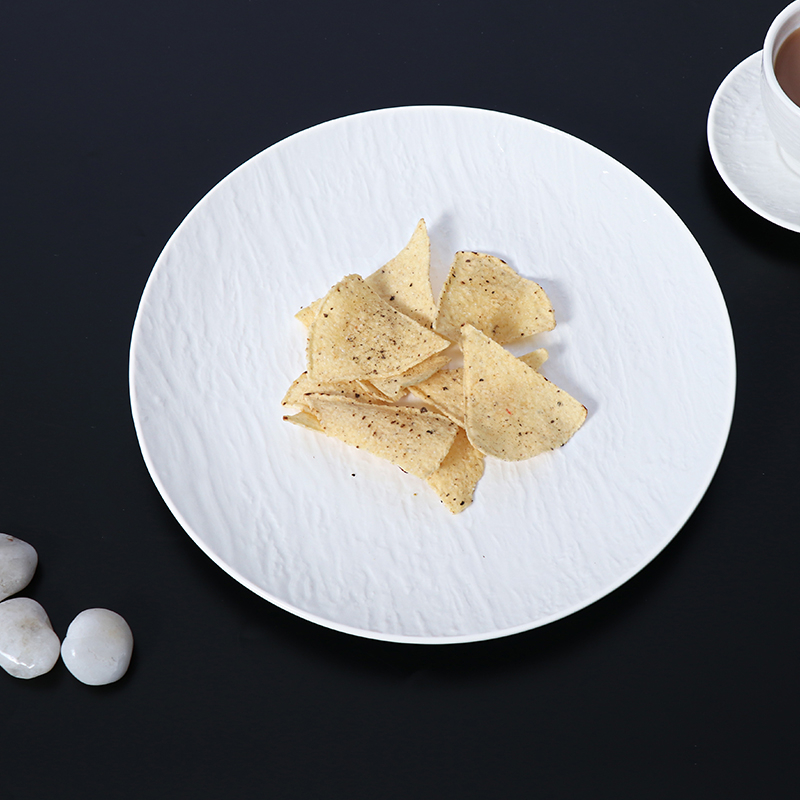
Test whether the outer detailing remains visible with a normal serving. Keep sauce and garnish within the useful center where appropriate. A coherent white design can connect starters, mains, and desserts through shape while leaving the food to provide much of the color.
Dark glazes can distinguish pale food, while light surfaces can reveal sauces and browned ingredients clearly. Neither choice improves every dish. Compare representative recipes, including the ones least likely to flatter the proposed finish. A dinnerware program should serve the entire menu rather than only its most photogenic item.
Do not translate color into unsupported claims about higher spending, stronger appetite, or guaranteed social sharing. Treat those as business outcomes that need evidence from your own operation. The immediate, defensible goal is readable food presentation that expresses the restaurant's chosen visual identity.
A distinctive table loses credibility when plates vary randomly between neighboring guests or staff cannot find the correct shape. Commercial dinnerware needs explicit operating rules. Define the dish-to-piece assignment, acceptable substitutes, and any orientation required by a shaped plate or printed motif.
Eat from the proposed piece with the normal cutlery. Check whether cutting feels stable, whether a spoon reaches the food comfortably, and whether the profile encourages sauce to move toward the edge. A sculptural plate can create an attractive photograph while making the meal awkward to eat.
Then set a complete table. Include water glasses, shared sides, condiments, and other recurring items. An accent platter that extends too far into adjacent settings may reduce practical comfort. Repeat the check on the smallest table used in normal service, where layout constraints are most evident.
Inspect the underside and the surfaces that contact other pieces. Measure a working stack and check whether staff can separate plates without dragging decoration or textured areas against neighboring ware. Reserve dedicated storage positions where unlike shapes would otherwise be stacked together.
Verify cleaning and heating instructions for the precise finish. A plain ceramic body and a decorated version of that body can have different limits. If an accent piece requires separate care, calculate whether the team can maintain that routine during peak service rather than approving it only under quiet conditions.
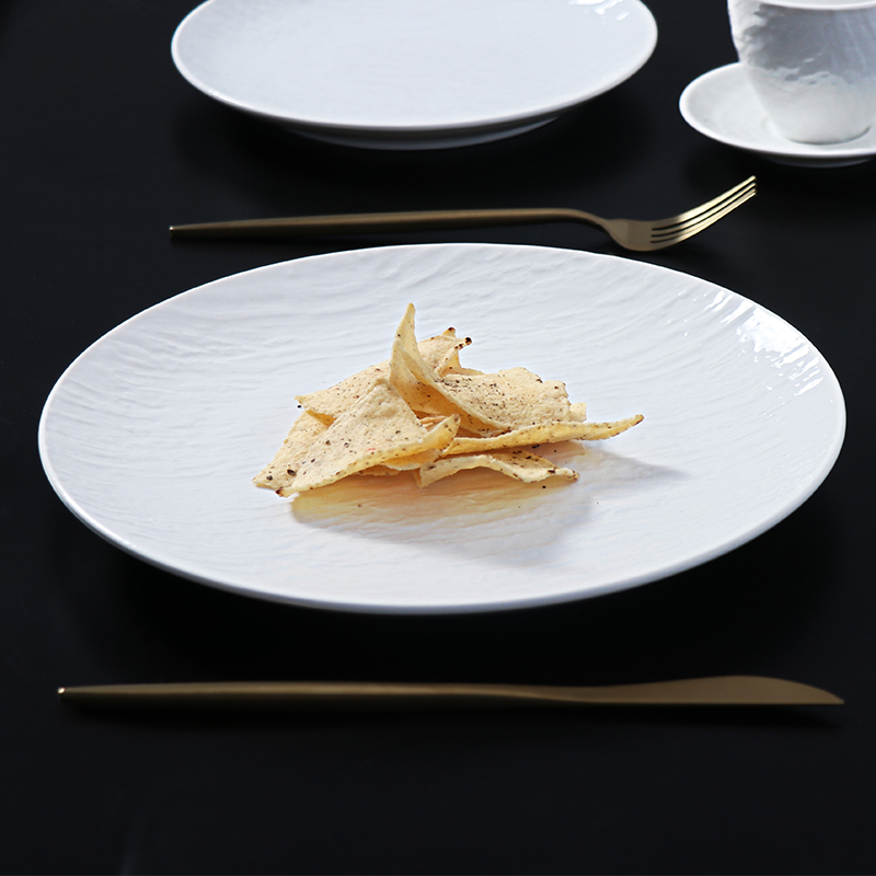
A variable glaze or handmade-looking surface may be part of the visual concept. Agree an acceptable range using several samples. Variation in color appearance does not authorize rocking bases, unstable stacks, sharp edges, or defects that affect cleaning and use.
Keep reference images for presentation, but retain physical samples for acceptance. Photographs are poor substitutes for assessing weight, texture, and fit. The commercial dinnerware specification should separate aesthetic variation from the functional tolerances required by the kitchen and service team.
Document the simplest rules staff need: which dish uses the accent piece, how it is oriented, where it is stored, and when a substitute is allowed. A short visual service sheet can preserve the intended signature more effectively than a lengthy design explanation that never reaches the pass.
Customization can make a tabletop identity more specific, but it creates new approval and replenishment questions. Consider whether a stock shape with selected color or artwork would achieve the required result before developing an entirely new form. A new shape is useful only when its functional or visual advantages justify the additional commitments.
First define the piece's purpose, useful dimensions, and equipment constraints. Then approve visual references or artwork, followed by physical samples and agreed production criteria. Separate these decisions so approval of a color concept is not mistaken for acceptance of weight, stacking, or finished dimensions.
For custom commercial dinnerware, establish who owns artwork and any tooling, how modifications are authorized, and what happens when a repeat batch is needed. Ask about setup costs, minimum quantities, and lead times for each relevant stage. Do not assume an initial quote includes every future change.
A high-use accent piece may require a different reserve from a rarely ordered tasting item. Estimate concurrent demand and record losses after opening. Track the signature shape separately so a healthy total dinnerware count does not conceal a shortage of the piece essential to a particular dish.
Design brief element | What to agree |
|---|---|
Primary use | Dish, portion, sauce behavior, and service route |
Visual identity | Color range, motif placement, and relationship to the base collection |
Functional acceptance | Flatness, working area, handling, stacking, and equipment fit |
Repeat orders | Item references, minimum quantities, and matching expectations |
Substitution | Alternative piece and occasions when it may be used |
Avoid building the budget around promised marketing returns. Account for purchase, development, delivery, storage, and replacement costs first. If the restaurant later measures stronger engagement or improved presentation consistency, those observations can inform the next phase without being assumed in the original investment case.
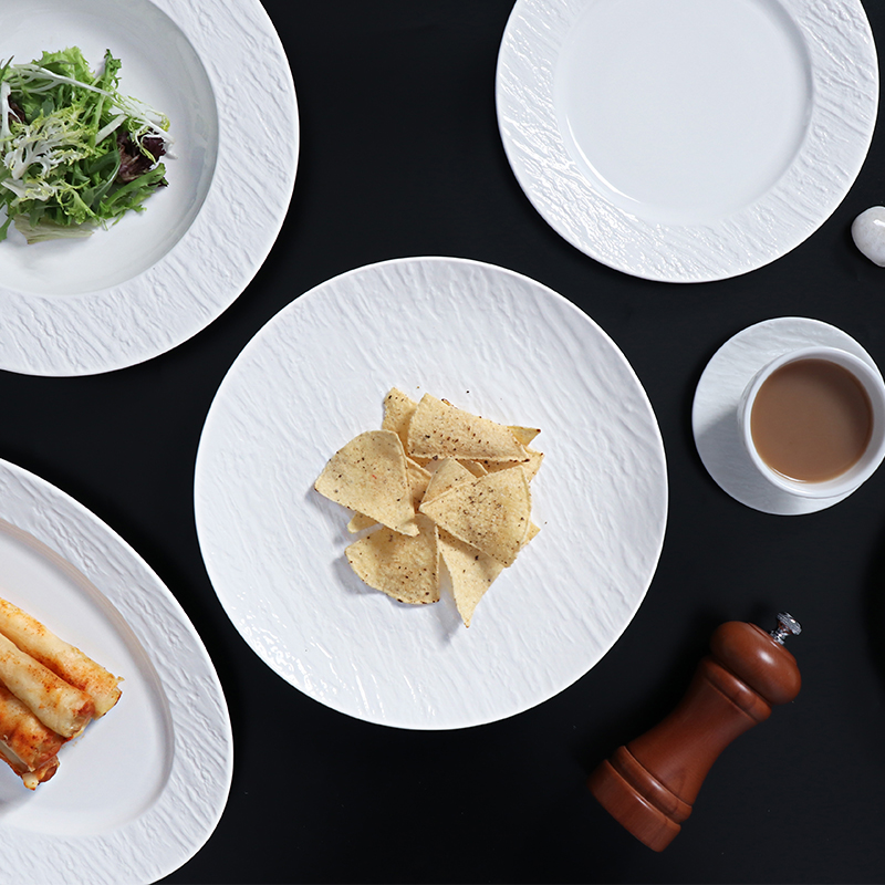
Introduce the signature program gradually where practical. Start with a role that can be evaluated clearly and compare the intended presentation with actual service execution. If the accent works, extend its design cues to other suitable pieces. Expansion should follow a demonstrated operational fit rather than the desire to make every course look different.
Review the program when the menu changes. Some pieces may keep their original role, others may move to a tested fallback, and some may need retiring from active use. Maintaining a distinctive commercial dinnerware program means preserving a coherent visual logic while allowing the restaurant to evolve.
One-of-a-kind restaurant presentation comes from deliberate choices that remain recognizable through daily service. Use a versatile base, add accents with defined roles, and verify the guest experience alongside handling, washing, and storage. Rollin Porcelain is a ceramic tableware manufacturer and supplier with white and decorated hospitality options. Its collections can be assessed against a restaurant's own design brief and service requirements. Choose commercial dinnerware that supports the food and can be replenished consistently, so the table's character remains intentional after the opening photographs, seasonal menu changes, and inevitable stock losses.
No. A distinctive combination of stock pieces can create a recognizable presentation when its shape, color, and dish assignments are coherent. Custom development becomes worthwhile when existing collections cannot achieve a specific functional or visual requirement.
Yes, if its dimensions and finish suit several planned dishes. Test potential replacements before buying. A flexible accent piece can retain the restaurant's identity while allowing ingredients and plating to change.
Only when the sequence has a clear visual purpose and the operation can manage it. Repeated cues can provide continuity more simply. Evaluate the whole meal together rather than approving each course as an isolated photograph.
They can, but define stock ownership and transfer rules. Shared accents may disappear from the outlet that needs them most. Confirm that both outlets follow compatible care instructions and record transfers separately from breakage.
Keep the base collection visually adaptable and concentrate strong branding in a limited accent layer. Before commissioning logos or unusual colors, consider which parts of the visual identity are likely to remain stable over the collection's working life.
